…Though this is probably a good thing if you are mordanting yarn…
True confessions… I hate to baby-sit anything. I am bored, distracted, whatever you want to call it after about 5 seconds. Yes, I’m the most patient person in the world, but I have ADD, meaning I get distracted easily, and always have to have my hands busy…
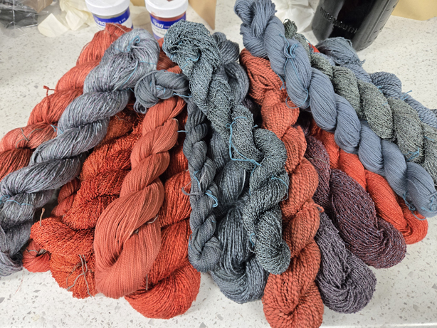
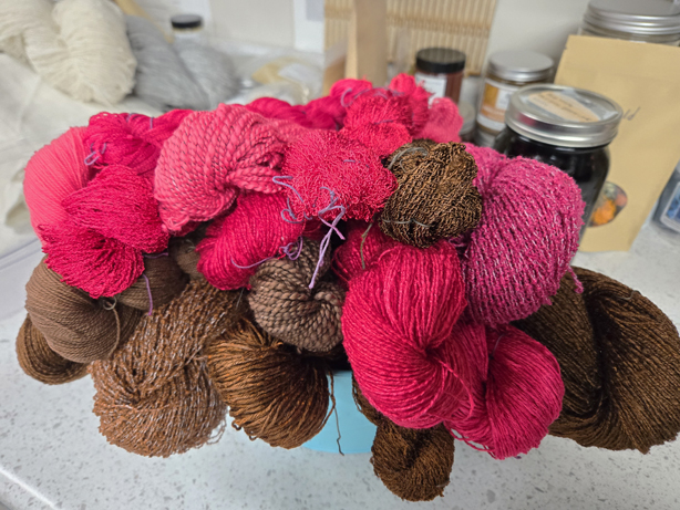
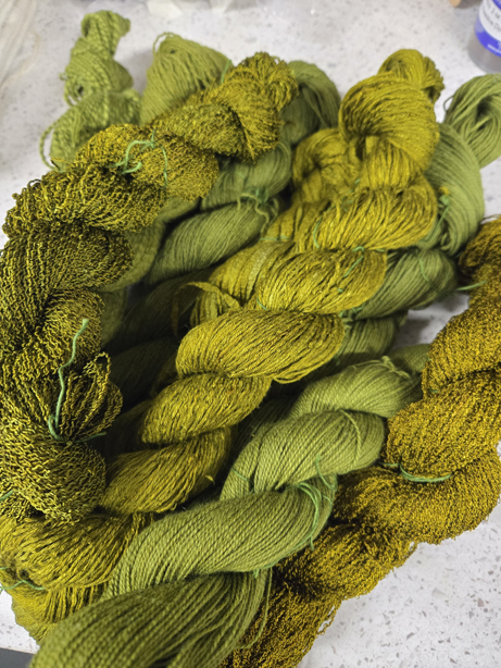
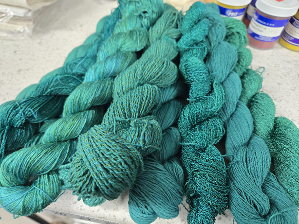
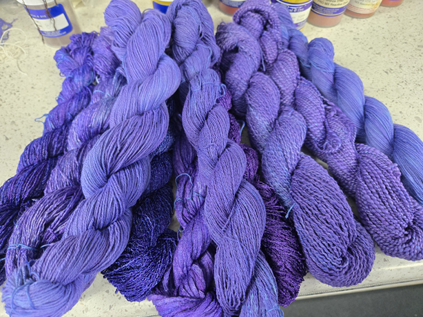
So I finished my Fiber-Reactive dye sessions for January, my shelves are overflowing with colorful skeins that I’m itching to play with. Dyeing with MX Fiber-Reactive dyes, you set up the pot and leave it over night. Set it and forget it…
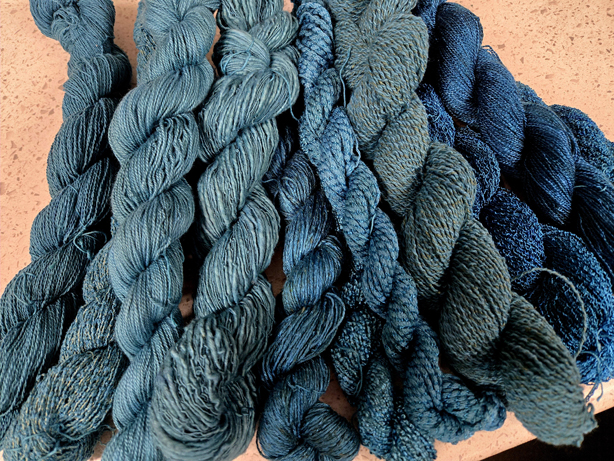
February 1st, I decided it was time to revisit and continue on my natural dye education and move onto the next step, which is mordanting the wool yarns, and wool fabric in the kit I purchased from Maiwa, to be able to follow along in the 10 module class.
I had previously attempted to mordant yarn, a step necessary before dyeing, and was using a regular electric hot plate, and of course, because I absolutely can’t stand to sit and watch a pot to keep it from boiling, I got distracted by something else in the studio, and I ended up felting the yarn.
I decided it was the fault of the hot plate, since it was electric, and I’m use to cooking with gas. I had seen instructors use induction burners, and I thought, that would be perfect. So I ordered one. I found out pretty quickly that it wouldn’t work for my purposes because it had two settings, 140 degrees, which is about my hot water from the tap, and 212 degrees, which is boiling. Nothing in between. You can’t hold anything at a simmer.
So I ordered another one. This one, a Duxtop, I did a bit more research, and reading the manual online, it had, starting at 140 degrees F, increments of 20 degrees up to 460 degrees F. I bought it last fall, and finally took it out of the box.
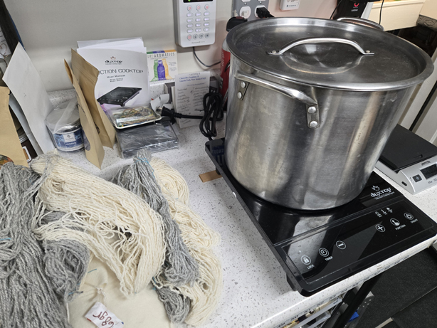
I thought, this will be great, set it and forget it. Yeah… no… I take my wetted, scoured wool yarn, and gently place it in the pot with the correct percentage WOF of Potassium Aluminum Sulfate, and set the temp to 180 degrees. I walk away. I didn’t feel like much was happening, so I put in my dye studio thermometer, and no matter how long I waited, the temperature never got above 140 degrees. Great, I’m figuring it is defective. I go back and reread the directions and there, in the fine print, it says, “…different cookware yields different temperatures, the temperature readout is only an estimate of the actual cooking temperature. It is accurate enough for daily cooking requirements. (No it is not…) The temperature in your pan may be different than the setting you have selected. Please test a few times to find the proper temperature setting for your particular cooking task and cookware…”
Sigh…
So pinned up to my wall is a note, that after some testing and constant pot watching, I’ve determined that to get the temp up to 190 degrees, I need to set the induction burner temp to 280 degrees, and once it reaches 190 degrees, drop the temp to 260 degrees where it will hold at 190 degrees for the hour I need to mordant the fiber.
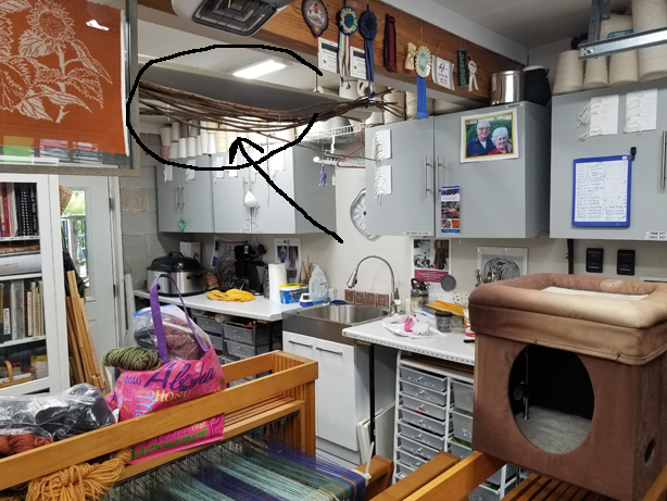
Of course I’m bored and distracted the whole time, and my studio is one giant distraction. I get into trouble when I can’t focus on a task. I look up at the ceiling and what to I see? A pile of 6-8 ft. lengths of climbing rose runners we trimmed from the rose arbor back in 2021.
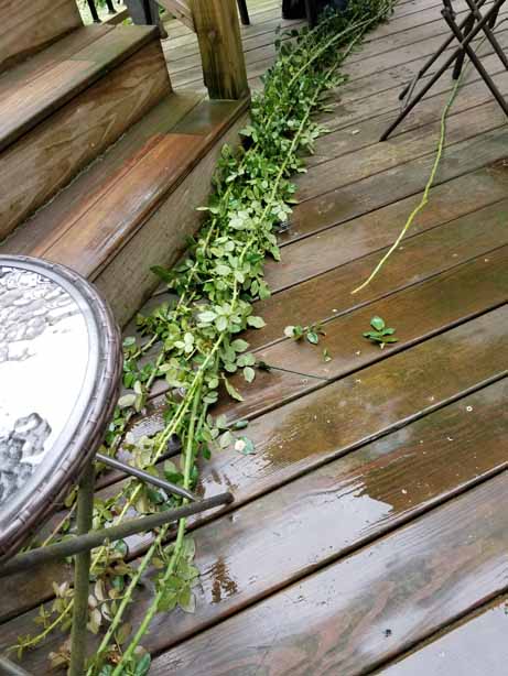
I know it was 2021, because I found a photo I took after we cut them. My daughter I remember, spent an entire Saturday breaking off all the thorns.
My intent at the time, was to use them for basketry; some of them were 3/8″ thick. Last summer, when I took a freeform basket class at Peters Valley, I took one of the lengths, and soaked it overnight in my pond, the only water body big enough, and brought it to class. The teacher began to play with it and we realized that these runners when dry are hollow, so they just bent in half, instead of curving into something I could use for a handle or a rim.
So I’m babysitting a pot, and staring at these runners in the ceiling, and I go off on a super unrelated tangent. I need to use them, or get rid of them. I’m sick of dusting plant materials in the ceiling.
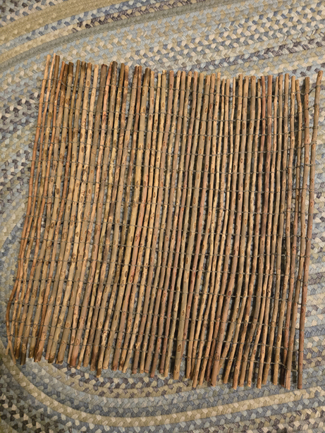
I ended up cutting the rose runners into 24″ lengths. This idea popped into my head, influenced by a willow tray I made in a different class at Peters Valley last summer, that I could line up all the 24″ lengths and make a garden fence of sorts. I thought about weaving them, but I wanted space between the elements, and though I could use a leno technique, I just didn’t see how it was realistic to weave these into what I wanted.
So my next thought was some kind of knotting. Long story short, spending lots of time watching pots and thinking of all the possibilities, I ended up using a skein I had of Euroflax wet-spun linen, and suspending the first 24″ length from the frame over the door of my shower stall. From there, I added the lengths of linen, and did a couple square knots between each additional rose length. I found a bunch of knitting yarn bobs, and used them to support the long length of linen I cut. I soaked the rose runners in a large plastic basin on the floor of my shower as I worked.
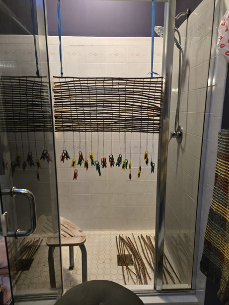
It took a couple of days, but I’m really happy with my little fence.
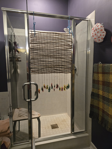
When we converted the garage into the studio, I had a split ductless Heat and AC unit put into the block on the north side. It attaches to a compressor at the base of the foundation on the outside. It blows a continuous warm dry air, which has killed most of the plants in that particular area.
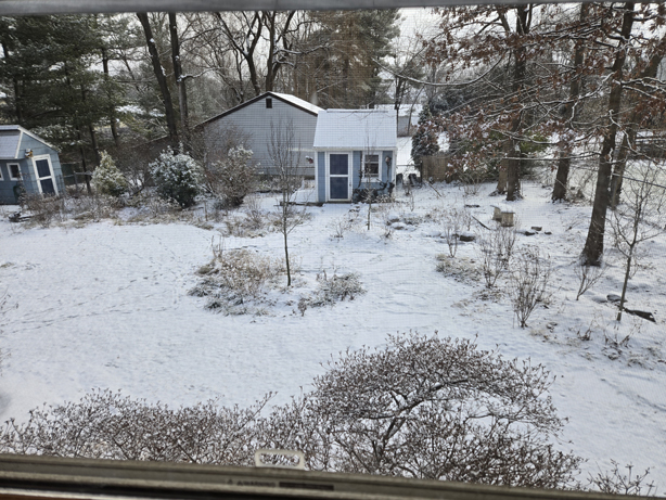
My landscape designer found an American Holly and told me that it would be happy in that location, and so last fall she planted it. I worry that the steady stream of dry air would affect the holly, it looked a little dry on the leaf tips that faced the compressor unit. And so, even though overnight, we got about 5 inches of snow with a quarter inch glaze of ice on top, I worked my way out to the side of the house, and placed my little fence behind the holly, which was looking a bit glazed from the ice.
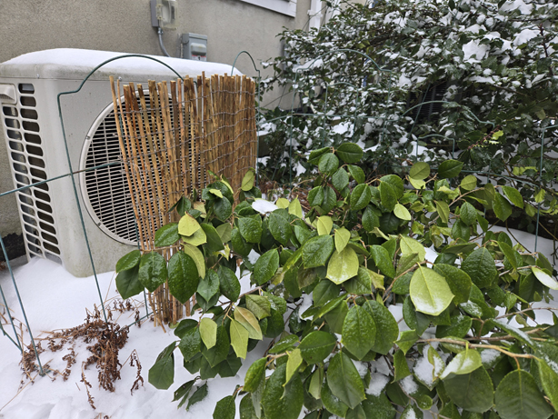
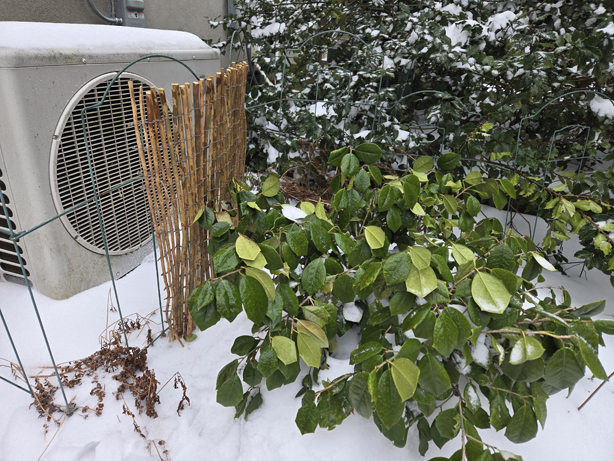
I’m so very very proud of my little fence. I wish I had a willow patch. But I’ll settle for cutting more of the rose runners as they reach for the sky this coming year.
Meanwhile… I eat my meals at the puzzle table, otherwise I’ll mindlessly doom scroll on my phone. My mom loaned me a puzzle someone gave her, a brand I’d never heard of, Pickforu, which featured cats in stained glass. This was one of the most fun puzzles I’ve ever done, the colors are magnificent. (I’ve since ordered three more from Amazon…)
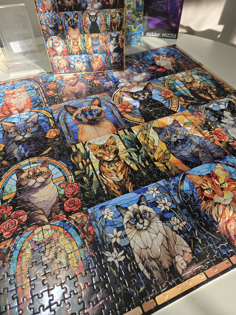
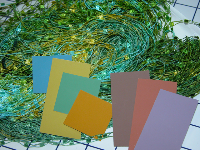
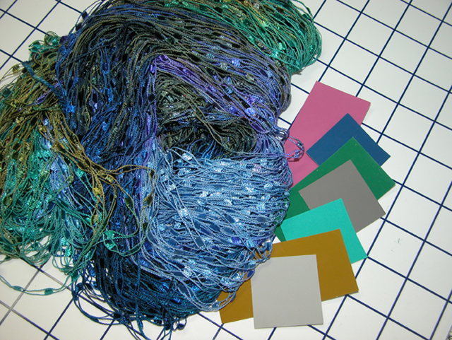
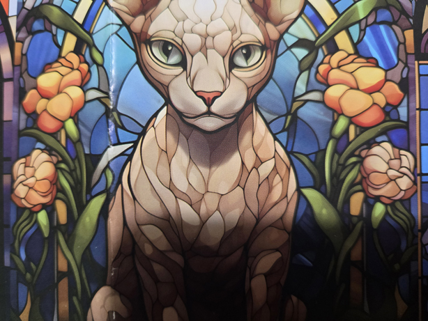
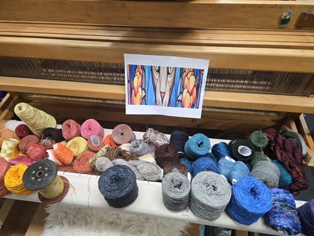
I grabbed a bunch of pictures of the poster, and thought about what I could do with those colors, and all that newly dyed yarn just hanging off the shelves in my overflowing studio.
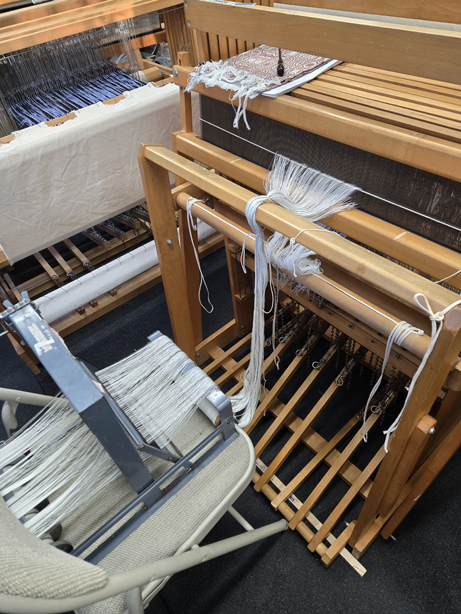
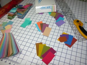
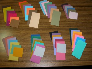
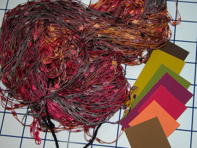
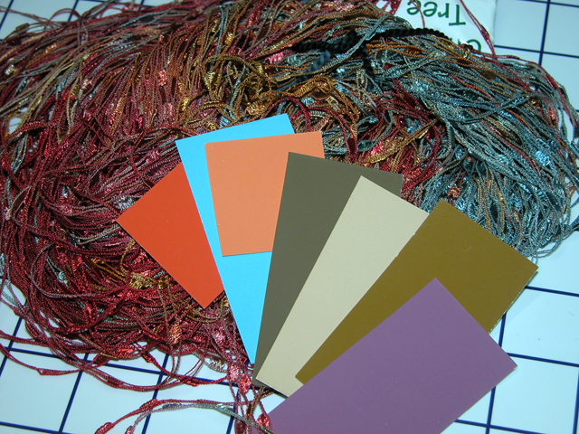
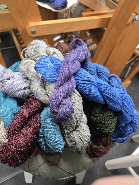
I went around and pulled everything I thought could work in a color layout for a scarf run. I could use more scarves in my collection of things to sell at the guild sale, give as gifts, give as donations, etc. I figure I’ll put on a 12 yard warp. Maybe get 5 scarves?
The yarns that were skeined for dyeing had to be wound into cakes of course, which required hours of baby sitting the electric cake winder. I have one from Boye, it really is not a good product, but it is what I have and there aren’t a lot of reasonably priced alternatives out there. So I babysat for hours today, transferring the skeins to the electric cake winder.
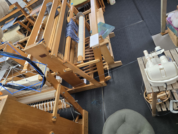
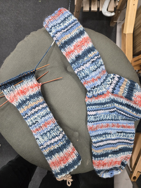
And while I sat and monitored the action of winder, I knitted. I’m working on the second sock, which I started after my trip to Japan, 2023?
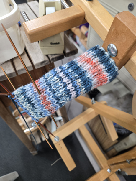
By the end of the day, or quitting time which is when I get attacked by all the animals for dinner, I had started the heel flap for the second sock.
I only have a couple more skeins to transfer to cakes, and I can start doing a yarn wrap. Really looking forward to this next adventure. And yeah, I still have to monitor the pots and mordant the silk and the cellulose fabrics. At least those won’t felt…
Stay tuned…
