The little stop sign with the exclamation point in the lower right hand corner of my Firefox Internet screen on my computer has been staring at me all day, with dire warnings of the impending nor’easter on its way up the coast. I’m checking the predictions, sort of, every once in awhile, largely because we have tickets to the Baltimore Consort at the Cloisters in northern Manhattan tomorrow afternoon, when the storm is suppose to hit, but I’m not paying too much attention, because weather patterns are unpredictable around here, they make better headlines than true predictions. At the moment, there is a 3-6″ prediction of snow for our area, which by Jersey standards is pretty nothing, if it turns out to be more like 3″. An hour south of us, there is a prediction of 6-12″. But the winds are suppose to be fierce, so weather patterns can shift a few miles and come in faster or slower, and the whole prediction ends up causing a lot of eye rolling and unnecessary panic. Nevertheless, I sent my son out to pick up a couple of things at the grocery store, that we desperately needed, like half and half, because you can’t have coffee in this house without half and half, and he came back to report that the grocery store was mobbed, and shelves are being cleaned off like there was a severe famine on its way up the coast.
 So, I decided to spend the day, keeping an eye loosely on the radar, in my pajamas, in front of my computer, researching colors for next spring. Sounded like a good antidote to stupid headlines and dreary bleak weather. I have a couple of favorite sites, Design-Options, and Pantone, both have information about colors for the upcoming seasons, and I get an idea of the general direction of the trends. Not that it is that important, but I’m always curious, and sometimes I
 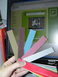 get inspired by a particular palette. I found a very cool You Tube Video on the Pantone site, and I watched it about 8 times, sitting with my little fan of Color-aid papers, getting a feel for the combinations. If you watch the video, which talks about how the colors are forecasted, make sure the sound on your computer is on, the adjectives the narrator uses are important, but comical at times, like the Thesaurus was brought out and dusted off. There were some great phrases like “subtly sumptuous”, “halcyon days”, tapestries of experience”, “adaptive attitude”, and “symbiosis of hues”. I particularly liked, “inventive integrity” and “soul searching and sustainability…”
I have a large block of Color-aid papers, there are 314 colors in all, and I lopped off the top one inch of each paper and put them on a screw post, so I would have an easy reference for playing around, while maintaining the paper order. Each of the papers in the full set has a code on the back that helps identify the color. So I watched the video, and pulled palettes that I thought I’d enjoy dyeing, I’ll spend more time this weekend tweaking and narrowing down, but I had a good start. Also, ProChem, where I buy my MX Fiber Reactive dyes, has a PDF on their website that gives the Pantone colors for Spring of 2010, with directions for how to dye each color. How handy is that!
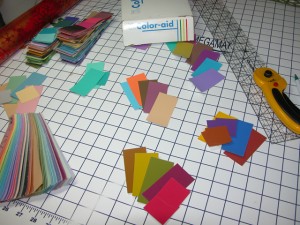
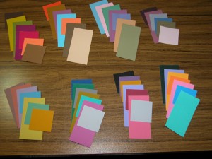 And I spent the day just playing with color. I outlined the eight palettes as I interpreted them from the Pantone site, comparing them to the Spring 2010 colors from Design-Options, and I cut little Color-aid chips, and played around with arrangements.
This is the sort of thing I would do twice a year for Handwoven Magazine when I use to do the articles for them on Color and Fabric Forecasting. I’ve heard during my travels, how many mourn the loss of the column, but the reality is, the column was costly to produce and you the reader can easily with a handy computer and your own block of Color-aid papers, do your own search and experiment. Google “Colors Spring 2010” and see what you get…
Now that I have a bunch of potential palettes in front of me, I started looking at space dyed skeins I had laying around the studio, to get a feel for narrower palettes and more monochromatic possibilities, and largely this was just fun to see the palettes next to yarn. The skeins are from Cherry Tree Hill and they are a funky novelty knitting yarn. I think these were from the batch of novelties I picked up last summer at the Midwest Conference.
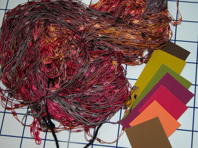
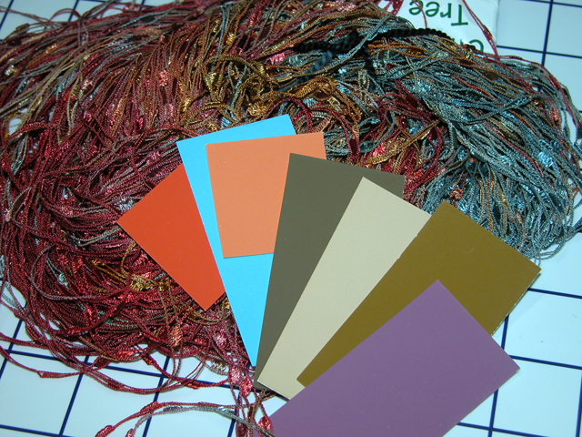
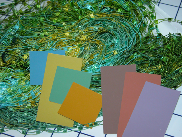
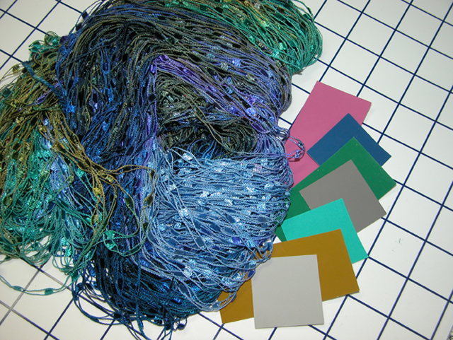 I may be housebound this weekend, but I have a bunch of white warps, and a cabinet full of dyes, and I can crank up the wood stove to keep the room temp about 70 degrees for curing, and I can have a colorful weekend in spite of the frightful weather outside!